
DEC 12, 2017 BY HUDSON JUNGCK
You will find David McCandless’s informationisbeautiful.net in a shamefully neglected corner of the web. McCandless and his team visualize immense volumes of information—from the dates and extremes of media panics to the names of hipster coffee shops—in graphics at once intuitive and brilliant.
For instance, “The Middle East” portrays the region’s intricate network of alliance and antagonism.
At first glance, it seems unwieldy, even ugly.

But on closer inspection, the image comes alive. When you scroll over a name (say, Russia), the bonds of friendship, hatred, and tension connected to that name flare up, enabling you to work your way through the region one player at a time.

Or take the “World’s Biggest Data Breaches,” in which every major data breach since 2004 appears as one in a sea of overlapping bubbles (Hint: Equifax was less than a seventh the size of the largest incident).

Clicking on a bubble ‘pops’ it to show a brief description of the breach. You can choose what the size and color of the bubbles represent. You can even set which bubbles you want to see.

Another ingenious project comes from Finland, and uses UN data to visualize refugee migration to Europe. At Lucify.com, viewers can manipulate a timeline and track asylum seekers—represented by luminescent dots—from their journey’s beginning in (say) Syria to its end in (say) Germany.

Some harbor a certain skepticism toward such simplification. How can you make sure that you’re representing data fairly? Accurately?
And they have a point. The adage that statistics lie is so widespread and, frankly, true, that the internet now attributes it to Albert Einstein—a sure-fire sign your quote has arrived.
But a couple features distinguish the best “data viz” projects.
First, these projects clearly identify their sources. InformationisBeautiful links the raw data below each image, while Lucify does so in an associated blog.
Second, the creators of top-tier infographics know they’re simplifying. Neither McCandless nor Lucify frame their graphics as comprehensive. Lucify includes their shortcomings as a disclaimer, while McCandless includes a record of updates to his work.
What can we learn from their projects?
To begin with, beauty and insight are far from opposed, and are, if anything, closer than we ever imagined. The more creatively we approach a data set, the more readily we can understand and act on it.
Yet the limitations of these sweeping projects suggest another idea.
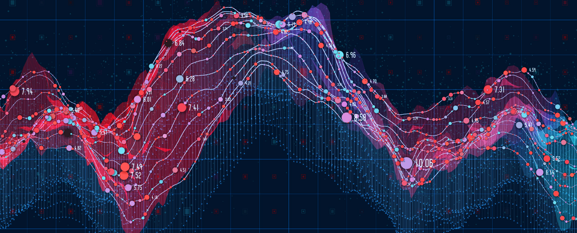
Suppose that you applied the same principles to financial records. Suppose that you could pair beauty and insight on a different scale, with greater volatility and more complex dimensions. Suppose you could do so with pinpoint accuracy.
Suppose you could drill down to the most granular level. Suppose you could select which variables you wanted to see, and which ones you didn’t. Suppose you could toggle between displays, see your results as a heat-map, a pivot-table, or a column chart. Suppose you could drill through to examine data from 360°. Suppose you could hold data and rotate it like a physical object.
With Xledger:
- Your data no longer needs a disclaimer
- You gain precision without sacrificing beauty.
- Your can make sharper, faster, and more confident decisions than you ever thought possible.